Simplifying UI through
Animated product lotties
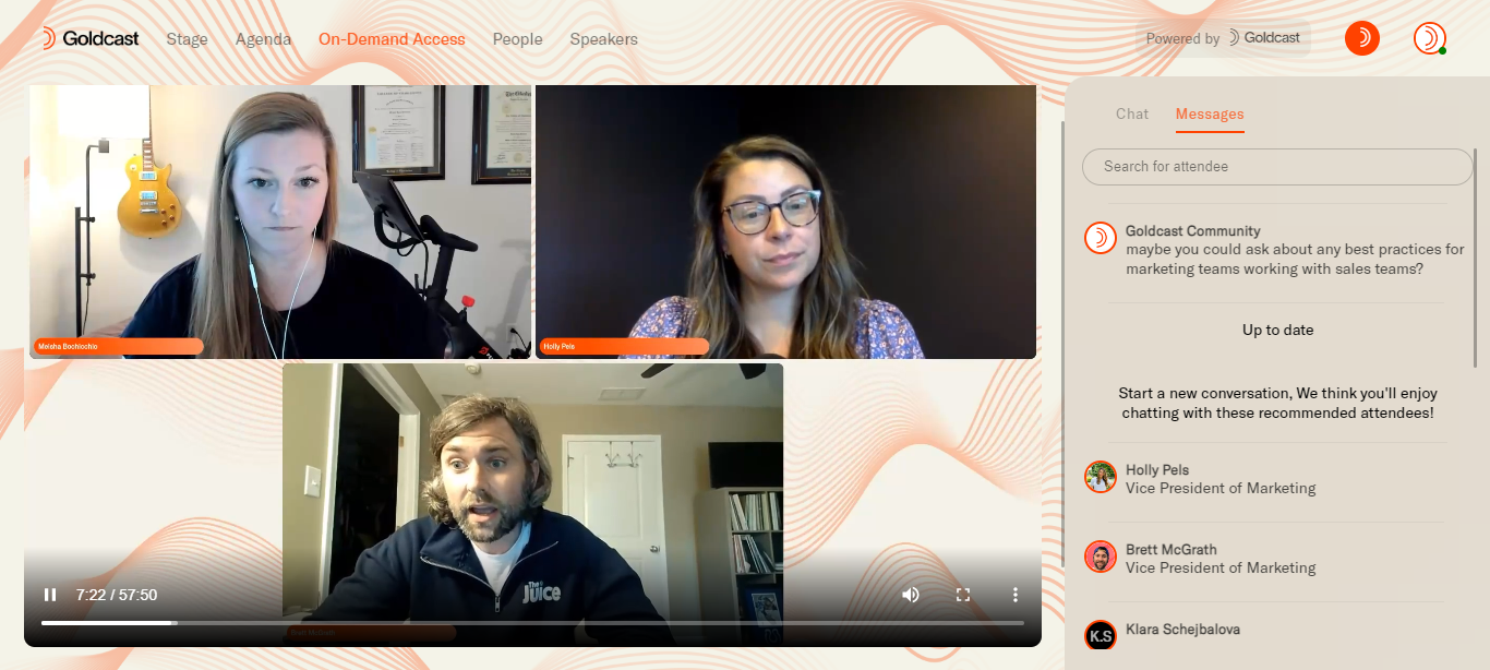
Problem Statement
The product UI looked cluttered and difficult to understand, as screen recordings of the platform didn't look real on the web. The platform wasn't effectively communicating all its product use cases, leading to a confusing and inconsistent user experience.


Solution
To simplify the product UI and improve the user experience, the design team decided to create Lotties, animated illustrations that provide a smooth and uniform flow across all product pages.
Design Process
The design team started by laying out a few design directions. After considering all options, they decided to take a direction that allowed users to see the whole platform at a glance. This design was then tested by teams across marketing, sales, and customer success to ensure that it was effective for different purposes and audiences.

Result
The uniform direction was widely accepted, and the Lotties helped to create a cleaner and less cluttered website. The design was shown during discovery calls and was used by internal client teams to communicate the platform more effectively. The simplified UI improved the user experience and helped to effectively communicate the platform's product use cases.
Conclusion
By simplifying the UI through animated illustrations, the design team was able to improve the user experience and effectively communicate the platform's product use cases. The Lotties provided a smooth and uniform flow across all product pages and created a cleaner and less cluttered website. The design was widely accepted and effectively used by different teams for different purposes.


